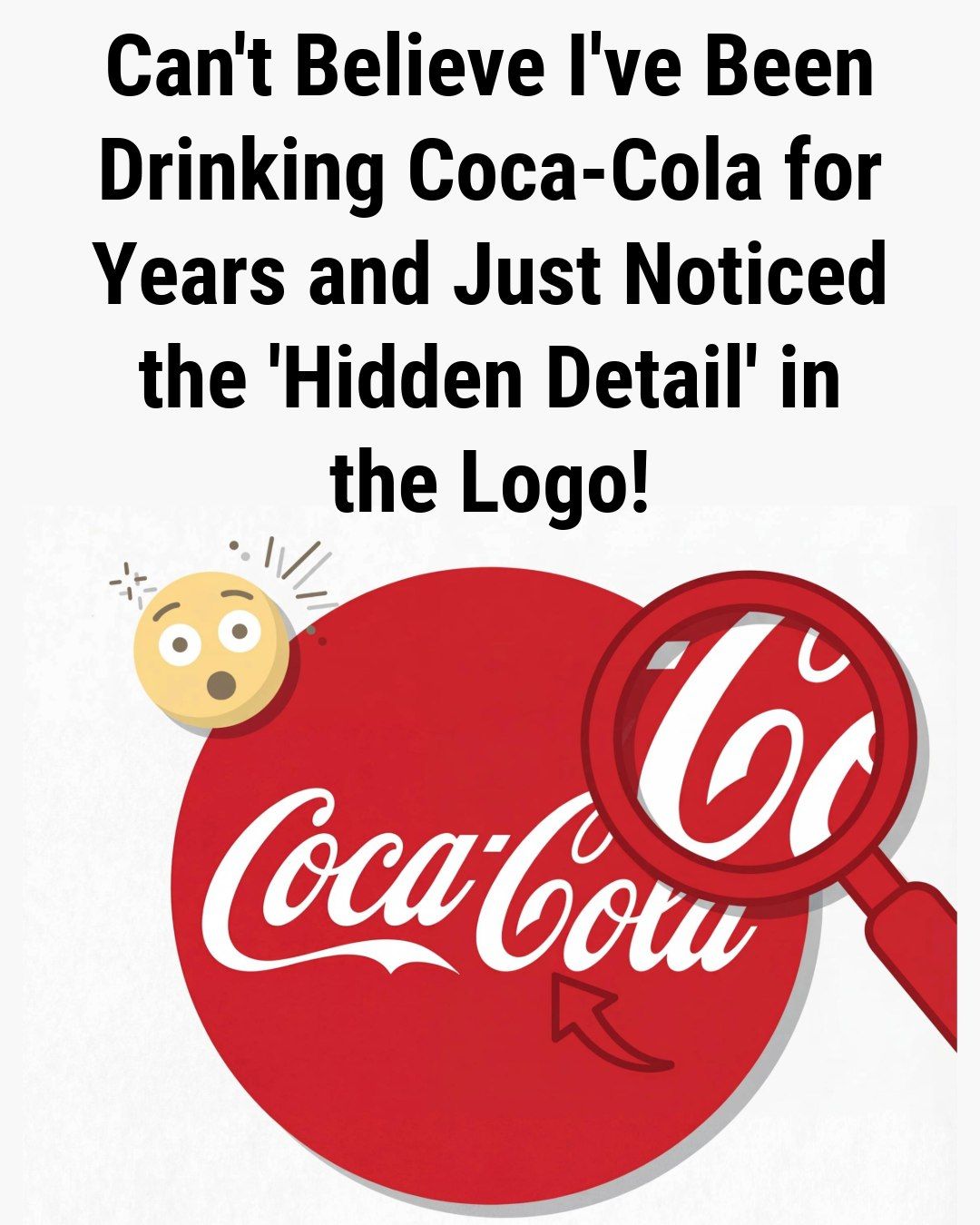
The discovery centers on the graceful, looping curves of the Spencerian script, specifically within the second word of the brand name. Observers have begun to point out that the way the letter C in Cola interacts with the surrounding flourishes creates the unmistakable image of a human smile. The bottom curve of the letter arcs upward in a buoyant, expressive manner, mimicking the gentle upturn of a grin. For many, the logo no longer looks like mere typography; it looks like it is reacting to the consumer, offering a warm and friendly greeting before the first sip is even taken.
To understand the truth behind the smile, one must journey back to the origin of the brand. The logo was not the product of a high priced graphic design firm or a psychological focus group. Instead, it was penned by Frank Mason Robinson, the bookkeeper for the drink’s inventor, John Stith Pemberton.